Motion Graphics: From Idea to Execution and Its Impact on Branding & Sales

What is Motion Graphics?

Motion Graphics refers to the design and animation of graphic elements to visually convey messages, information, or stories. Unlike traditional animation, motion graphics typically include graphic design, typography, icons, charts, and 2D or 3D visuals brought to life through movement.

By combining art, technology, and creative techniques, motion graphics communicate brand messages in an engaging and impactful way. This tool is essential not only in advertising and marketing but also in education, information campaigns, service introductions, and cultural awareness initiatives.

Motion Graphics History

  1. Roots and Precursors (Before 1960)

Motion graphics originated from traditional animation and graphic design. Before computers, artists used manual techniques:

  • Frame-by-Frame Animation: Drawings on celluloid were displayed in rapid succession.
  • Film Titles and Credits: In the 1920s–1930s, animated film titles began. Designers like Saul Bass in the 1950s–60s gained fame for creative title sequences, e.g., Psycho and North by Northwest.
  1. 1960s–1970s – Television and Educational Films
  • Charts and simple animations explained complex data.
  • TV credits and short ads became widespread.
  • Focus on clarity, readability, and quick communication.
  1. 1980s – Computer Graphics and Early Software
  • Early programs like Deluxe Paint and Quantel Paintbox emerged.
  • TV and advertising animations became digital.
  • Integration of graphics, motion, and sound allowed faster edits.
  1. 1990s – Modern Software & Standardization
  • Adobe After Effects (1993): A milestone enabling 2D graphic animation.
  • Softimage & 3D Studio Max: Introduced 3D capabilities.
  • Layering, masks, and effects enhanced project complexity.
  1. 2000s – Internet & Digital Media Expansion
  • Short, engaging motion graphics became essential for websites and social media.
  • Software like Cinema 4D enabled realistic 3D design.
  • Focus shifted to user experience and interaction.
  1. 2010s–Present – Interactive and Smart Motion Graphics
  • Integration of 3D, VR/AR, and AI for immersive experiences.
  • User interaction through web and apps.
  • Styles include infographics, explainer videos, character animation, and minimalism.

Key Milestones in Motion Graphics Evolution

  1. From manual to digital: Celluloid & hand-drawing → professional software.
  2. Focus on branding and advertising: Motion graphics became a key marketing tool.
  3. Multi-platform adaptability: TV, web, mobile, social media.
  4. Combining art and data: Simplifying messages while presenting information.
  5. User engagement: Directly impacting audience behavior and decision-making.

Leading Countries and Top Rankings (2025)

Country

Strengths & Distinct Styles

USA

Minimalist and advertising styles; professional tools like AE & Cinema 4D; online branding & ads

Canada

Creative explainer and social projects; story-driven style

Germany

Precision, industrial & technical motion graphics; scientific info-focused

Japan

Minimalist style, vibrant colors, character animation; cultural storytelling

UK

Luxury brand campaigns; combining 2D & 3D with stunning VFX

South Korea

Fast, engaging digital designs for social media; modern & tech-focused

Iran

Rapid growth in advertising motion graphics & infographics; digital branding & social content

Importance of Motion Graphics in Branding & Marketing

  • Strong Branding: Visual storytelling strengthens brand identity.
  • Customer Trust & Loyalty: Professional design and high-quality visuals increase credibility.
  • Boost Sales: Motion-driven messages influence purchasing decisions more effectively.
  • Education & Information: Simplifies complex concepts.
  • Cultural & Behavioral Impact: Movement, colors, and narratives shape audience perception.

Impact on the Advertising Industry

  • Audience Engagement: Smooth, attractive movements capture attention instantly.
  • Simplifying Complex Messages: Technical or abstract info becomes digestible.
  • Brand Recall: Animated logos and title sequences improve memorability.
  • Consumer Behavior Influence: Storytelling and emotion drive purchase intent.
  • Digital & Social Media Optimization: Short motion videos perform best on Instagram, TikTok, LinkedIn.
  • Professional Brand Image: Regular use in campaigns portrays a modern and credible brand.

Motion Graphics Team Requirements

  • Creative Director: Ideation & project leadership
  • Graphic Designer: Visual elements, icons, characters, typography
  • Animator: Motion & animation
  • Sound Designer & Editor: Music, sound effects, final editing

Essential Skills

  • Software Proficiency:
    • 2D: Adobe After Effects, Illustrator, Photoshop
    • 3D: Cinema 4D, Blender, Maya
    • Editing: Premiere Pro, Final Cut Pro
  • Color, motion, and UX psychology
  • Visual storytelling

Motion Graphics Design & Production Process

  1. Research & Concept: Brand goals, audience, competitors.
  2. Storyboarding & Concept Design: Narrative, frame sketches, key points.
  3. Graphic Design: Colors, fonts, logo, icons, charts, visual elements.
  4. Animation & Motion: 2D/3D, frame-by-frame, motion tracking.
  5. Sound Design & Music: Matching rhythm with visuals.
  6. Editing & Rendering: Format, resolution, social media standards.

Styles & Dominant Trends

  • Flat & Minimal Design
  • Infographic Motion
  • Explainer Videos
  • 3D Motion Graphics

Technical & Expert Tips

  • Color psychology aligns with brand messaging
  • Fonts must be readable and brand-appropriate
  • Video length: short for social media, longer for education
  • Visual identity and logo consistency

Impact on Sales & Market

  • Higher engagement and content views
  • Stronger brand identity & recall
  • Enhanced credibility through design quality
  • Indirect marketing via digital brochures & service introductions
  • Influences consumer behavior and purchase decisions

Project Costs & Timeline

  • Factors: Duration, design complexity, team expertise, software.
  • Standard Timeline:
    • Short (30s–1 min): 1–2 weeks
    • Long (2–5 min): 3–6 weeks
  • Costs: Based on team expertise, software, production time, project complexity

Motion Graphics, SEO & Content Marketing

  • Boosts user dwell time, a key SEO factor
  • SEO-friendly captions improve visibility on Google & YouTube
  • Short, engaging motion content increases social shares and organic traffic

Future Trends (2025)

  • AI-driven animation & personalized content
  • Interactive motion graphics (web & apps)
  • Minimal & 2.5D styles for fast production and clear visuals
  • Hybrid real + digital campaigns

Cultural & Social Impact

  • Raises social awareness through educational and environmental campaigns
  • Shapes lifestyle & culture, not just sales
  • Example: Food or sports brands promoting healthy or fun lifestyles enhance audience loyalty

Professional Audience Highlights

  • Quality production requires graphic design, storytelling, sound, and VFX
  • Even 30-second videos may take days to produce; higher quality = higher ROI
  • Essential tools: After Effects, Cinema 4D, Blender, Premiere Pro, Figma for storyboard/prototyping

Conclusion

Motion graphics are a powerful tool for education, advertising, service introduction, and branding. Proper design, color/font selection, visual identity alignment, and high production quality are keys to project success.

A professional motion graphic not only communicates your brand message attractively but also:

  • Shows brand credibility & professionalism
  • Builds customer trust & loyalty
  • Directly impacts sales & audience decisions
  • Creates a lasting brand experience in the audience’s mind

Everything About Packaging: From the Beginning to Today

What is Packaging?

Packaging has been with humans since the dawn of civilization. Early humans used natural materials like leaves, animal skins, woven baskets, and clay pots to store and transport food or tools. This simple need marked the beginning of product packaging.

As civilizations advanced, new materials entered the packaging world—from glass and bronze containers to wooden barrels and woven sacks. Each innovation helped humans better store and protect food and goods.

Paper played a crucial role in packaging. The Chinese were the first to use paper for food packaging around the 1st and 2nd centuries BCE. Later, the Romans used recycled paper to package perfumes. One of the earliest historical records comes from 1035 CE, when a Persian traveler observed vegetables, spices, and goods in Cairo markets being wrapped in paper and sold to customers.

This historical journey shows that packaging is not only a practical tool but also part of culture, economy, and even brand identity. From ancient times to today, packaging has always responded to a basic human need: protection, ease of transport, and ultimately, impact on the consumer.

History of Packaging

  • Early Humans: Thousands of years ago, humans used leaves, animal skins, hollow stones, and shells for storage and transportation.
  • Ancient Era: Egyptians and Greeks used clay jars, amphorae, and wooden boxes to store and transport food and drinks.
  • Middle Ages: Leather, fabric, and wooden chests were common.
  • Industrial Revolution (18th–19th Century): Mass production increased the need for standardized and durable packaging. Glass, metal cans, and printed paper were widely used.
  • 20th Century: The advent of plastic revolutionized packaging. Lightweight, inexpensive, and durable, it transformed the industry.
  • Today: Packaging serves not only protective functions but also branding, marketing, and competitive purposes. Smart, biodegradable, and digital packaging is emerging.

Why Packaging Matters

Modern packaging is not just for product protection. Its key roles include:

  • Protection: Preventing physical damage, contamination, moisture, light, and heat.
  • Ease of Transport: Standardizing dimensions and weight for logistics.
  • Information: Providing essential product details, like manufacturing date, ingredients, and usage instructions.
  • Brand Identity: The first touchpoint with the customer is often the packaging.
  • Influence on Purchase Decisions: 70% of buying decisions in-store or online are influenced by packaging appearance.
  • User Experience (UX): Creative packaging can turn unboxing into a memorable experience.

What If There Was No Packaging?

Without packaging, our daily lives would be very different and challenging:

  1. Products would become contaminated or unsafe. Food and beverages would be exposed to dust, bacteria, and environmental conditions.
  2. Transportation would be difficult. Carrying products like rice or milk without durable packaging would be challenging.
  3. Brands would remain unknown. Packaging conveys logos, colors, and brand identity. Without it, all products would look the same.
  4. Customer choice would be harder. Attractive and functional packaging guides consumer decisions.
  5. Markets would be limited. Exporting and shipping products over long distances relies on packaging.

Packaging is more than just a cover; it’s vital for health, safety, logistics, marketing, and daily life.

Types of Packaging

By Material

  1. Paper & Paperboard Packaging
    • Features: Lightweight, high-quality printing, cost-effective, eco-friendly.
    • Applications: Cardboard boxes, shopping bags, dry food, pharmaceuticals, cosmetics.
    • Advantages: Recyclable, versatile design, creative printing possible.
    • Challenges: Low resistance to moisture and high pressure.
  2. Plastic Packaging
    • Features: Lightweight, flexible, moisture-resistant.
    • Applications: PET bottles, wraps, bags, disposable containers.
    • Advantages: Affordable, versatile shaping, durable.
    • Challenges: Environmental pollution, recycling difficulties.
  3. Glass Packaging
    • Features: Transparent, hygienic, chemically resistant.
    • Applications: Bottles, jars for beverages, honey, cosmetics.
    • Advantages: Fully recyclable, preserves taste, luxurious look.
    • Challenges: Fragility, heavy.
  4. Metal Packaging
    • Features: Strong, impermeable to light and oxygen.
    • Applications: Cans, beverages, sprays.
    • Advantages: Long shelf-life, excellent protection.
    • Challenges: Heavier than plastic, higher cost.
  5. Wooden Packaging
    • Features: Strong, ideal for heavy transport.
    • Applications: Gift boxes, luxury products, industrial transport.
    • Advantages: High durability, natural appearance.
    • Challenges: Heavy, costly.
  6. Textile & Natural Fiber Packaging
    • Features: Lightweight, reusable, eco-friendly.
    • Applications: Fabric bags, gift packaging, promotional bags.
    • Advantages: Durable, reusable, promotional.
    • Challenges: Low moisture resistance.
  7. Composite Packaging
    • Features: Mix of paper, plastic, foil for extra strength.
    • Applications: Dairy, coffee, processed food.
    • Advantages: Preserves freshness, lightweight, moisture-resistant.
    • Challenges: Harder to recycle.
  8. Biodegradable & Smart Packaging
    • Features: Eco-friendly, biodegradable materials.
    • Applications: Food, pharmaceuticals, socially responsible brands.
    • Advantages: Environmentally friendly, improves brand image.
    • Challenges: Higher production cost, sometimes less durable.

By Structure

  1. Flexible Packaging
    • Soft structure (plastic, foil, paper laminate), lightweight, space-efficient, visually appealing.
    • Applications: Snacks, chocolate wrappers, hygiene products, small apparel/accessories.
  2. Rigid Packaging (Hardbox)
    • Non-flexible (glass, metal, hard plastic), durable, premium look.
    • Applications: Glass bottles, metal cans, luxury boxes, chemicals, detergents.

By Function in Sales

  1. Primary Packaging: Directly contacts product. Example: chip bags, beverage bottles.
  2. Secondary Packaging: Protects primary, aids transport, enhances shelf presentation. Example: cardboard packs of multiple beverages.
  3. Tertiary Packaging: Bulk transport and logistics. Example: master cartons, pallets.
  4. Quaternary Packaging: For international shipping and long-term storage. Example: shipping containers, chemical transport.

By Market Application

  • Food
  • Pharmaceutical
  • Industrial
  • Luxury & Gift
  • Retail & Promotional

Key Points in Packaging Design

  • Bleed: Extra space around design (1.5mm minimum).
  • Box Layout: Align fold lines with cardboard flute.
  • Cutting Distance: Minimum 3mm between blades.
  • Lip Edge (for die-cut machines): Proper alignment prevents miscuts.
  • Color & Brand Identity: Match brand colors, CMYK/Pantone standards.
  • Font & Readability: Key information must be legible.
  • Material Choice: Match product sensitivity, consider eco-friendliness.
  • Unboxing Experience: Enhance customer delight.
  • Safety & Protection: Prevent damage or tampering.
  • Legal Information: Comply with labeling and regulatory standards.
  • Transport & Storage: Support palletization, stacking, moisture, and pressure resistance.

Product Packaging and Brand Identity

  • Packaging creates brand recognition, protects the product, and ensures ease of transport.
  • Research shows consumers take less than 7 seconds to decide on a product—packaging must attract attention immediately.
  • Investing in packaging design directly affects sales and brand positioning.

Principles of Successful Packaging

  • Safety and health compliance
  • Ease of use
  • Environmental sustainability
  • Brand identity alignment
  • Complete information
  • Creativity

Dos: Use colors consistent with the product, creative designs, consider cultural aspects, optimize for e-commerce.
Don’ts: Excess harmful plastics, complex opening, illegible fonts, copying competitors.

Impact of Packaging on Sales

  • First Impression: Customers decide in the first 7 seconds.
  • Emotional Influence: Colors, fonts, images evoke trust, excitement, or luxury.
  • Brand Positioning: Brands can stand out among competitors.
  • Consumer Loyalty: Creative unboxing builds attachment.

All About Cardboard, Cartons, and Die-Cut

  • Importance: Beyond product protection, premium cardboard and precise die-cut templates elevate brand identity.
  • Benefits:
    • Enhances unboxing experience
    • Increases perceived product value
    • Differentiates brand visually
  • Applications: Food, luxury goods, electronics, promotional gifts

Major Packaging Festivals Worldwide

  1. Pentawards: Recognizes global packaging creativity and innovation.
  2. WorldStar Packaging Awards: Organized by WPO, evaluates innovation, sustainability, and performance.
  3. Red Dot – Packaging Design: Celebrates functional and aesthetic excellence.
  4. iF Design Award – Packaging: Highlights combination of functionality and beauty.

The Future of Packaging

  • Smart Packaging: QR codes, NFC, interactive experiences.
  • Sustainable Materials: Recyclable, biodegradable packaging.
  • Enhanced User Experience: Easy-to-open, visually attractive.
  • Integration with Digital Marketing: Packaging becomes part of social media campaigns.

Conclusion

From ancient times to today, packaging is no longer just a protective cover. It’s an essential tool for branding, marketing, sustainability, and customer experience. Creative, functional, and eco-friendly packaging ensures product safety, delights the consumer, and leaves a lasting impression.


Everything About Catalog Design,  From Concept to Completion

Definition of a Catalog and Its Role in Marketing

A catalog is a strategic marketing and advertising tool designed to showcase a company’s products, services, or brand identity through a combination of text, images, and visual design. It serves as both a visual and informational guide, helping potential customers better understand the features, advantages, and value propositions of what you offer.

From traditional printed versions to today’s digital and interactive catalogs, this medium has remained one of the most effective ways to present products and strengthen brand communication. Whether distributed in trade shows, retail stores, or online platforms, a well-designed catalog continues to play a vital role in connecting brands with their audience.

Types of Catalogs

  1. Based on Purpose
  • Promotional Catalog: Created for trade shows, exhibitions, or marketing events to introduce products or services.
  • Corporate Catalog: Highlights a company’s history, mission, and portfolio of projects.
  • Retail Catalog: Lists products with prices, specifications, and visuals for easy comparison.
  • Industrial Catalog: Used in B2B industries to present machinery, technical equipment, or engineering services in detail.
  • Digital or E-Catalog: Interactive or downloadable versions (PDF, HTML, or app-based) for online viewing and sharing.
  1. Based on Format and Design
  • Leaflet or Single-Page Catalog: Simple, budget-friendly, and ideal for quick product introductions.
  • Booklet Catalog: The most common format with a designed cover, interior pages, and back page.
  • Luxury Catalog: Premium edition featuring special finishes (spot UV, embossing, gold foil), thick matte/glossy paper, and creative layouts for luxury brands.
  • Interactive Digital Catalog: Includes animations, videos, hyperlinks, and e-commerce integration for an engaging user experience.
  1. Based on Size and Dimensions
  • A4 (21×29.7 cm): The most standard and widely used format.
  • A5 (14.8×21 cm): Compact, portable, and suitable for events or giveaways.
  • Square Format: Visually distinctive and often used by fashion, design, and creative brands.
  • Custom Size: Tailored for brands seeking uniqueness and strong visual differentiation

Why a Catalog Matters

A catalog is far more than a simple booklet,  it’s a strategic branding and sales instrument that influences how customers perceive your business and decide to purchase.

  1. A Branding Powerhouse

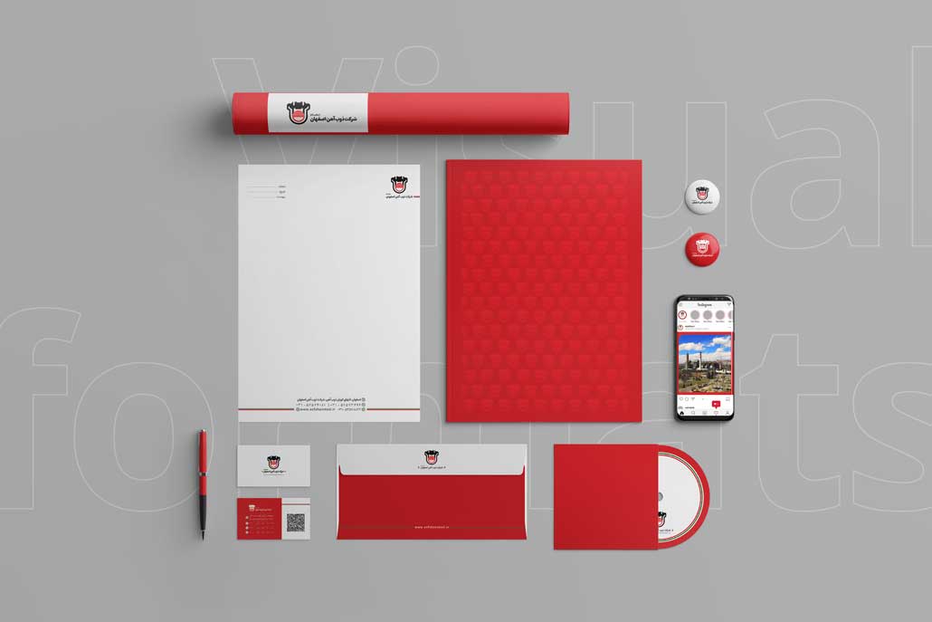
Your catalog is often the first physical or digital impression your audience has of your brand. Every element,  from layout and photography to typography and paper quality,  communicates your brand identity. A well-designed catalog visually reinforces who you are and what you stand for.

  1. A Practical Buying Guide

A catalog acts as a decision-making assistant for customers. Clear images, concise descriptions, and detailed specifications help them compare options and make informed choices. This structure enhances trust and shortens the buyer’s journey.

  1. A Silent Sales Representative

Even when your sales team isn’t present, a catalog continues to sell on your behalf. Professionally written copy, persuasive visuals, and engaging design can subtly guide the reader toward conversion,  making the catalog an effective offline sales tool.

  1. Enhancing Brand Differentiation

In competitive markets, presentation matters. A unique, creative catalog helps distinguish your brand from others by showcasing your attention to detail and design sophistication. It positions your brand as trustworthy, innovative, and professional.

  1. A Bridge Between Offline and Online Marketing

Printed and digital catalogs complement each other perfectly:

  • Printed catalogs offer a tangible experience and are ideal for meetings, exhibitions, and retail environments.
  • Digital catalogs (PDFs, flipbooks, or web versions) expand your reach,  they can be easily downloaded, shared on social media, or embedded in your website.

By integrating both formats, brands achieve greater visibility, engagement, and conversion rates across channels

The Role of Catalogs in Marketing and Sales

A professionally designed catalog is more than a visual showcase,  it’s a strategic marketing asset that directly influences customer perception, brand trust, and purchase behavior. Whether printed or digital, it serves as a key component in both offline and online marketing ecosystems.

  1. Building Trust and Credibility

A high-quality catalog immediately communicates professionalism and reliability. When customers see consistent branding, premium visuals, and clear information, they associate your business with expertise and integrity. This emotional response builds brand confidence and encourages long-term loyalty.

  1. Strengthening Brand Identity

A catalog is an extension of your visual identity system. Every detail,  from color palette and fonts to photography style,  should align with your brand guidelines. Consistency across all touchpoints reinforces recognition and helps customers connect emotionally with your brand.

  1. Supporting the Customer Decision Process

By presenting comprehensive product details,  features, benefits, prices, and high-quality images,  catalogs simplify the buyer’s decision-making process. Customers feel informed, respected, and empowered, leading to higher satisfaction and purchase intent.

  1. A Dual-Purpose Marketing Tool: Offline & Online
  • Offline Marketing: In exhibitions, trade fairs, and face-to-face meetings, printed catalogs serve as a tangible communication tool that leaves a lasting impression.
  • Online Marketing: Digital versions extend your reach beyond physical limits. They can be easily integrated into your website, social media, or email campaigns, ensuring global accessibility and instant sharing.
  1. Driving Sales, Directly and Indirectly

Research shows that brands using professional catalogs experience significantly higher conversion rates. Why? Because a catalog acts as a silent salesperson,  it tells your story, highlights value, and guides potential customers toward action even when no one from your team is present

Steps for Creating Effective Catalog Content

Creating a powerful catalog begins long before the design stage. The foundation lies in strategic content development,  understanding your brand, your audience, and the story you want to tell. A well-structured catalog communicates not just what you sell, but why it matters.

Here’s a step-by-step guide to building compelling catalog content:

  1. Understand the Brand and Its Purpose

Before writing a single line, define the core objective of your catalog:

  • Is it meant to introduce your brand?
  • Increase sales?
  • Educate potential buyers?
  • Present technical data or product updates?

The catalog’s tone, structure, and design should all align with its marketing goal,  whether it’s brand awareness, lead generation, or customer retention.

  1. Identify Your Target Audience

Who will read your catalog? Understanding the audience determines your language style, content depth, and visual approach.

  • General consumers: Prefer short, engaging text and eye-catching visuals.
  • Technical or industrial buyers: Need detailed specifications and factual accuracy.
  • Corporate clients or investors: Expect formal tone, case studies, and brand values.

Defining your audience ensures your message connects with the right people.

  1. Gather Information and Data

Collecting accurate and complete data is essential for credibility. This includes:

  • Full list of products or services.
  • Technical details (size, material, usage, price, etc.).
  • Unique Selling Points (USPs),  what sets your brand apart.
  • A brief brand story that conveys authenticity.
  • Professional imagery,  product photos, renders, or lifestyle visuals.
  1. Develop a Logical Content Structure

A professional catalog must be easy to follow. Organize content in a way that guides the reader naturally through your brand narrative. A common structure includes:

  1. Cover Page: Logo, tagline, and a strong visual hook.
  2. Brand Introduction: History, mission, and values.
  3. Table of Contents: Organized and easy to navigate.
  4. Product/Service Pages: Images, descriptions, key features, and benefits.
  5. Portfolio or Case Studies (optional): Real-world examples of your work.
  6. Contact Page: Website, social links, address, and QR code for quick access.
  7. Write Clear and Impactful Text

Good catalog writing is informative, persuasive, and concise. Keep sentences short, use active voice, and emphasize customer benefits.
Example:

  • ❌ “Our machine operates with a 5kW motor.”
  • ✅ “Powered by a 5kW motor for maximum efficiency and long-lasting performance.”

Avoid jargon where possible,  clarity and simplicity make your message more memorable and accessible.

  1. Visual Content Creation

Visual storytelling is just as important as written content. Invest in:

  • Professional product photography or industrial photo sessions.
  • 3D renderings for products still under development.
  • Supporting graphics such as icons, infographics, and charts to simplify complex data.

Images should be consistent in lighting, color tone, and background to maintain a cohesive look.

  1. Align with Brand Visual Identity

Consistency across all visual elements builds trust. Use your brand colors, typography, and graphic style as defined in your brand guidelines. This visual alignment makes your catalog instantly recognizable as part of your overall identity.

  1. Editing and Proofreading

Before moving to print or digital publishing:

  • Check all texts for grammar and spelling accuracy.
  • Verify product specifications and pricing.
  • Ensure all images are high resolution and print-ready.
  • Review page numbering and overall layout consistency.
  1. Preparing for Print or Digital Release

For printed versions:

  • Use CMYK color mode and 300 DPI resolution for accurate color output.
  • Select appropriate paper type and thickness (GSM).

For digital versions:

  • Export an interactive PDF or HTML e-catalog optimized for web.
  • Include clickable links, navigation buttons, and downloadable options.
  1. How Content Influences Sales

Well-crafted content transforms your catalog into a powerful sales driver.
It helps customers make confident decisions, reinforces brand reliability, and provides your sales team with a persuasive visual tool that speaks for your business,  anytime, anywhere

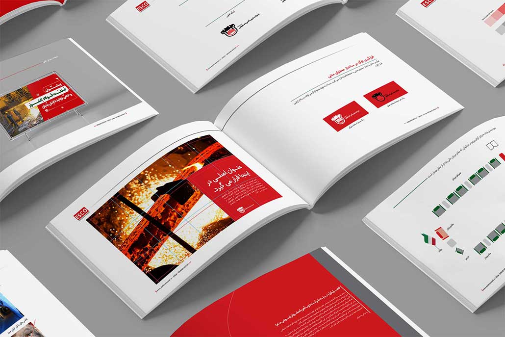
Catalog Graphic Design

Design is the silent ambassador of your brand,  and in a catalog, it speaks louder than words. A thoughtfully designed catalog not only presents information clearly but also strengthens your brand image, guiding customers through an enjoyable and persuasive visual journey.

Here are the main principles that define professional catalog design:

  1. Layout and Structure

The layout determines how information flows. A good structure should follow a logical visual rhythm:

  • Begin with a strong cover design that sets the tone.
  • Introduce brand story or mission statement in the opening pages.
  • Present products in organized sections (e.g., by category, use, or style).
  • End with a call to action,  contact info, QR codes, or social media links.
  1. Visual Hierarchy and Focus

Effective catalogs guide the reader’s eyes naturally. Use typographic contrast, color accents, and spacing to direct attention to key messages or featured products. Consistency in alignment and style enhances readability and professionalism.
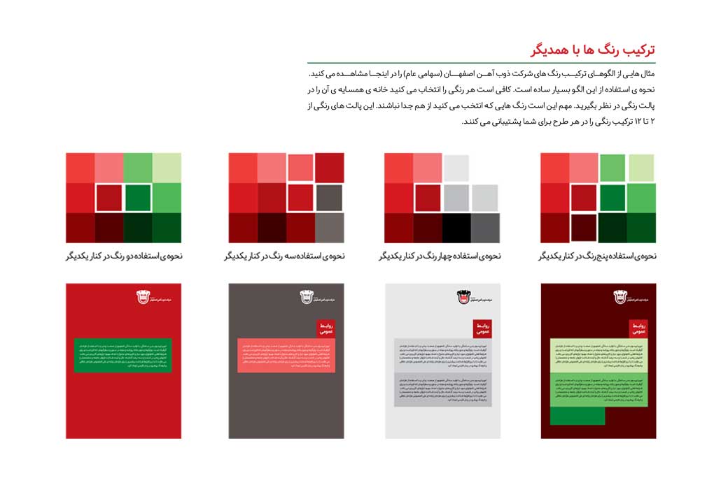
  1. Color Palette

Choose a color palette that reflects your brand identity and emotional tone:

  • Warm colors convey energy and passion.
  • Cool colors suggest trust and calm.
  • Neutral tones create elegance and balance.
    Colors should enhance photography and typography, not overpower them.
  1. Typography and Readability

Typography defines personality. Select two complementary font families,  one for headings and another for body text. Maintain consistent sizing, line spacing, and alignment for a harmonious look.
Readable typography encourages longer engagement and a better overall experience.

  1. Imagery and Composition

Use high-resolution images and maintain consistency in framing, lighting, and styling. Every photo should align with the catalog’s overall narrative. Combine full-page visuals with smaller product images for rhythm and balance.
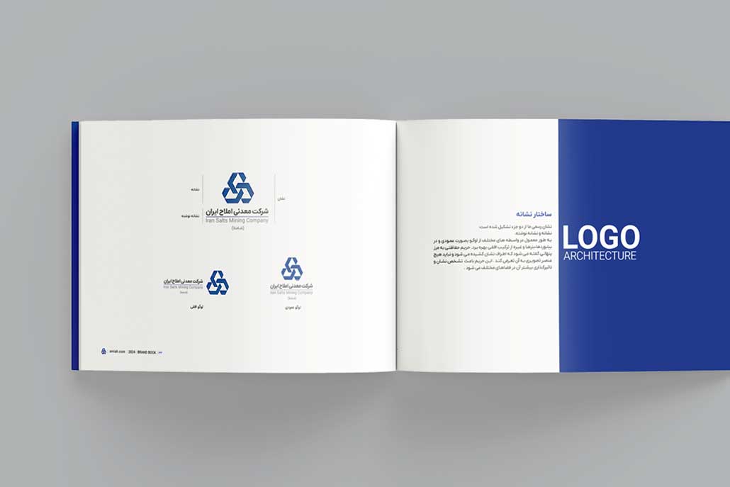
  1. Brand Integration

A professional catalog is an extension of the brand’s visual language. Include consistent use of your logo, icons, graphic patterns, and tone of voice. This coherence builds familiarity and reinforces recognition across marketing materials.

  1. Balance Between Creativity and Function

While creativity attracts attention, clarity drives conversion. The best catalog designs balance aesthetic innovation with usability,  ensuring that creativity never disrupts information flow or product focus

Color, Font, and Visual Style Guidelines

A catalog’s visual language reflects how your brand feels, communicates, and connects with its audience. The right combination of color, typography, and graphic elements builds emotional resonance and visual consistency across every page.

Here’s how to create a cohesive and impactful visual system:

  1. Color Psychology and Brand Emotion

Color is more than decoration,  it’s emotion in visual form. The right palette sets the mood and influences perception.

  • Red → energy, excitement, and urgency (ideal for sales or limited offers)
  • Blue → trust, reliability, and calm (common in corporate or tech brands)
  • Green → balance, growth, and sustainability (used for eco-friendly brands)
  • Black and Gold → luxury, exclusivity, and confidence
  • White and Neutrals → simplicity, modernity, and sophistication

Use no more than three dominant colors and a few secondary accents to maintain visual harmony. Always ensure high contrast between text and background for readability.


  1. Typography That Speaks Your Brand

Typography defines tone and professionalism. The goal is to find fonts that express your brand’s character while keeping legibility at every size.

  • Sans-serif fonts (e.g., Helvetica, Lato, Montserrat) → modern, minimal, and clean
  • Serif fonts (e.g., Playfair Display, Times New Roman) → classic, elegant, and trustworthy
  • Display fonts → artistic titles or creative headlines (use sparingly for emphasis)

Maintain consistency by defining:

  • Primary and secondary font families
  • Hierarchy (Headings → Subheadings → Body text → Captions)
  • Font sizes and line spacing for print standards
  1. Graphic Elements and Iconography

Icons, dividers, shapes, and visual motifs support navigation and reinforce brand aesthetics. For example:

  • Use thin-line icons for minimal, modern brands.
  • Apply geometric shapes for tech-oriented or industrial catalogs.
  • Integrate organic patterns or textures for natural or handmade product lines.

Visual consistency builds subconscious trust,  customers recognize your brand even before reading a word.

  1. Maintaining Brand Consistency Across Platforms

Your catalog should look and feel like an extension of your website, packaging, and digital campaigns.
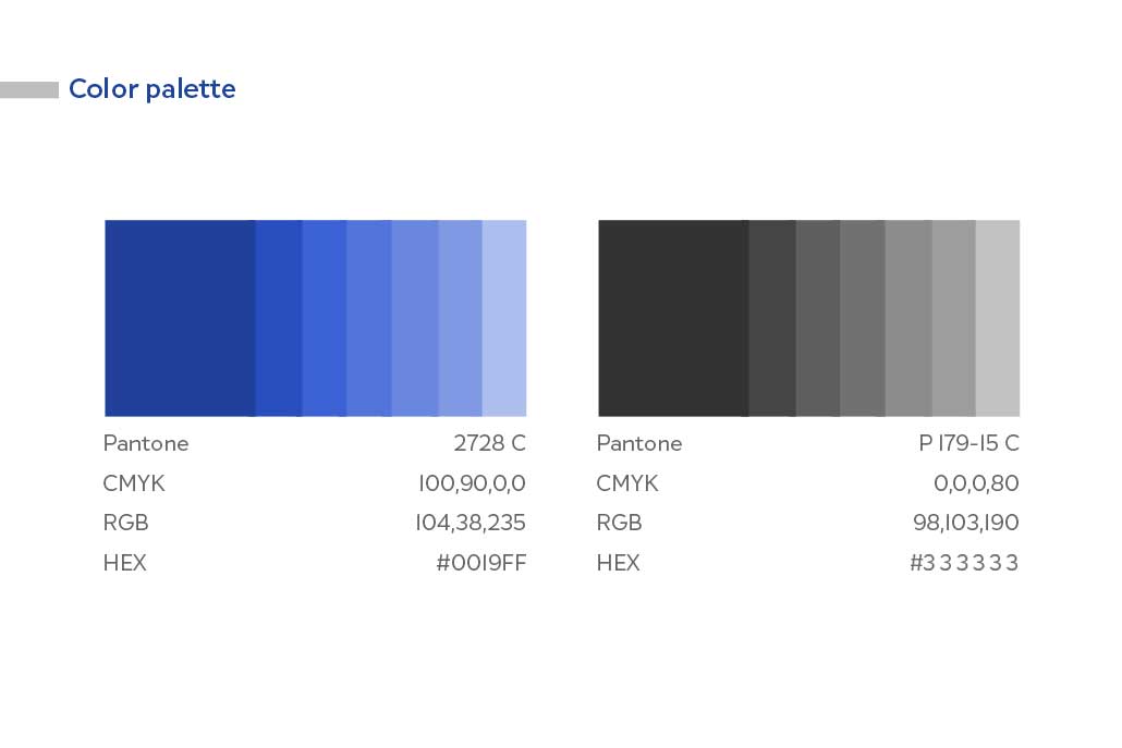
Create a Brand Style Guide that specifies:

  • Color codes (CMYK, RGB, HEX)
  • Font usage rules
  • Logo placement and spacing
  • Do’s and Don’ts for visual application

This ensures a unified brand image across print and digital touchpoints

Photography, Imagery, and Visual Composition

In catalog design, imagery is storytelling. Each photo, illustration, and visual element carries emotional weight,  influencing how customers perceive your products and how likely they are to engage or purchase.

A professional catalog transforms simple product photos into a visual narrative that builds trust and desire.

  1. The Role of Photography in Catalogs

High-quality images are the core of visual communication. They make products tangible, appealing, and credible. Poor or inconsistent photography can instantly reduce perceived value,  even if the product is excellent.

Professional catalogs use photography to:

  • Highlight product quality and detail
  • Reflect brand personality and lifestyle
  • Create a cohesive visual atmosphere that aligns with design and color palette
  1. Product Photography Best Practices

For effective catalog visuals, consistency is key. Consider:

  • Lighting: Soft, balanced lighting eliminates harsh shadows and creates natural depth.
  • Angles: Show key details and realistic proportions.
  • Backgrounds: Use clean, neutral backgrounds or contextual settings that reinforce the brand tone.
  • Scale and proportion: Include real-world references when needed (e.g., hand holding a product).
  • Retouching: Subtle enhancement is fine,  but avoid over-editing that distorts authenticity.
  1. Lifestyle Photography and Contextual Shots

While product-only shots show clarity, lifestyle imagery tells the story. It helps customers imagine your product in their own life.

For example:

  • A kitchenware brand might show a warm, lived-in kitchen scene.
  • A construction equipment company might show its machines in action.
  • A fashion catalog might present its clothing on real people, in natural lighting.

These emotional visuals create connection and aspiration,  two elements that drive conversions.

  1. Composition and Visual Balance

Effective composition keeps the reader’s attention flowing naturally across the page.
Key rules include:

  • The Rule of Thirds: Place subjects along grid intersections for visual interest.
  • Negative Space: Leave breathing room,  it emphasizes the product and prevents visual clutter.
  • Focus and Depth: Use shallow depth of field to isolate key details.

Every element,  from margins to image alignment,  should guide the viewer’s eye without distraction.

  1. Integrating Graphics with Photography

Combine photography and graphic design thoughtfully. Use overlays, shapes, or frames to enhance structure, not overpower it.
For example:

  • Light color blocks behind products to improve contrast.
  • Transparent shapes for modern layering effects.
  • Subtle shadows and reflections for realism.

When images and graphics blend seamlessly, your catalog feels polished, immersive, and premium.

Printed vs. Digital Catalogs

Today, catalogs exist in both physical and digital formats, each offering unique advantages. Smart brands leverage both to create a multichannel marketing experience that drives engagement, trust, and sales.

  1. Printed Catalogs, Tangibility and Credibility

Printed catalogs provide a physical, tactile experience that strengthens brand perception:

  • Creates a lasting impression during exhibitions, meetings, and retail interactions.
  • Enhances credibility and professionalism through premium paper, finishes, and binding.
  • Encourages prolonged browsing,  customers tend to spend more time with a well-designed printed catalog.

Printed catalogs work best for:

  • High-end products or luxury brands
  • Industrial and technical equipment catalogs
  • Trade shows, client meetings, or direct mail campaigns
  1. Digital Catalogs, Reach, Accessibility, and Interactivity

Digital catalogs are versatile and globally accessible:

  • Can be embedded on websites, shared via email, or linked on social media.
  • Support interactive features like clickable links, videos, animations, and online purchase options.
  • Easy to update,  product changes, pricing updates, or seasonal promotions can be applied instantly.

Digital catalogs are ideal for:

  • E-commerce platforms and online marketing campaigns
  • Engaging younger or tech-savvy audiences
  • Global reach without printing or distribution costs
  1. Combining Print and Digital for Maximum Impact

The most effective strategy is integrating both formats:

  • Use printed catalogs for physical engagement and to leave a tangible impression.
  • Provide digital versions for instant access, sharing, and interactive experiences.
  • Include QR codes in printed catalogs linking to digital content, bridging offline and online experiences.

By combining print and digital, brands achieve:

  • Higher brand visibility and recognition
  • Greater customer engagement and retention
  • Seamless sales funnels from initial exposure to purchase
  1. Choosing the Right Approach

Decide based on your:

  • Audience preferences
  • Marketing goals
  • Budget and production timelines

Even a single catalog can exist as both a print masterpiece and a digital powerhouse, offering complementary advantages that reinforce each other.

Catalog Sizes & Formats

The size and format of a catalog not only affect its visual appeal but also influence usability, portability, and reader engagement. Choosing the right dimensions ensures that your catalog communicates effectively while reinforcing brand identity.

  1. Standard Sizes
  • A4 (21×29.7 cm):
    • The most widely used format, ideal for most industries.
    • Provides ample space for high-quality images and detailed text.
    • Works well for both print and digital layouts.
  • A5 (14.8×21 cm):
    • Smaller and more portable, making it suitable for trade shows or gift catalogs.
    • Easier to handle and distribute, yet still offers enough space for product information.
  • Square Format (e.g., 20×20 cm or 21×21 cm):
    • Unique and eye-catching, often used by fashion, lifestyle, or creative brands.
    • Breaks the monotony of standard rectangular catalogs, emphasizing creativity.
  1. Custom Sizes
  • Custom formats allow brands to stand out from competitors and create memorable experiences.
  • Can include vertical, horizontal, or unconventional shapes to reflect brand personality.
  • Must consider printing constraints, binding options, and production costs.
  1. Format Considerations

When selecting a catalog size, consider:

  • Content Volume: More pages or detailed products may require larger formats like A4.
  • Audience: Portability is key for trade shows (A5) or direct mail.
  • Brand Image: Square or custom sizes can convey creativity, innovation, or luxury.
  1. Balancing Functionality and Design

The ideal catalog format strikes a balance between:

  • Visual impact: Large enough for images and infographics.
  • Ease of use: Comfortable to hold and flip through.
  • Brand identity: Format should align with overall brand tone and positioning.

A thoughtful choice of size enhances reader engagement, comprehension, and brand perception, making your catalog both functional and memorable

Paper Type & Weight (GSM)

The choice of paper directly impacts how your catalog is perceived. It affects color vibrancy, readability, durability, and overall brand image. A well-chosen paper creates a tangible sense of quality and professionalism.

  1. Common Paper Types
  • Glossy Coated Paper:
    • Reflective surface that makes colors and images pop.
    • Ideal for catalogs with rich photography and vibrant visuals.
  • Matte Coated Paper:
    • Smooth, non-reflective finish for a more sophisticated and modern look.
    • Reduces glare and enhances text readability.
  • Uncoated Paper (Offset / Text):
    • Provides a natural, organic feel.
    • Often used for eco-friendly brands or minimalist catalogs.
  • Kraft Paper:
    • Rough texture for artisanal or sustainable branding.
    • Gives a distinct and memorable tactile experience.


  1. Pape Weight (GSM)

The weight of the paper determines sturdiness and perceived value:

  • Interior Pages:
    • Typically 135–150 gsm for high-quality visual presentation.
    • Balances flexibility with durability.
  • Cover Pages:
    • Usually 250–300 gsm, often with additional coating or lamination.
    • Provides protection and enhances tactile appeal.


  1. Finishes and Coatings

Special finishes can elevate the catalog’s premium feel:

  • UV Coating / Spot UV: Adds gloss to selected areas like logos or images.
  • Soft-Touch Lamination: Velvety surface for luxury appeal.
  • Embossing / Debossing: Creates tactile impressions for logos or patterns.


  1. Matching Paper to Brand Identity

Selecting the right paper aligns with your brand personality and target audience:

  • Luxury brands → heavier, glossy or soft-touch paper with premium finishes.
  • Eco-conscious brands → recycled or uncoated natural textures.
  • Mass-market catalogs → lighter, cost-effective coated paper for bulk distribution.


  1. Impact on Reader Experience
  • Enhances perception of quality and professionalism.
  • Improves image sharpness and color reproduction.
  • Offers pleasant tactile feedback, increasing engagement and memorability.


Impact of Catalogs on Marketing & Sales

A professionally designed catalog is more than just a product listing,  it’s a strategic marketing tool that builds trust, supports brand recognition, and drives both direct and indirect sales.


  1. Building Trust and Brand Credibility
  • High-quality design and print signal professionalism and reliability.
  • Customers are more likely to engage with brands that invest in premium visual communication.
  • A polished catalog reinforces brand legitimacy and encourages customer confidence.


  1. Supporting Brand Identity and Storytelling
  • Catalogs communicate your brand values, mission, and personality through design, imagery, and messaging.
  • Consistent visual identity across catalog, website, and social media strengthens brand recall.
  • Engaging storytelling with visuals and text makes products more memorable.


  1. Assisting Customer Decision-Making
  • Detailed product descriptions, technical specifications, and high-quality images empower customers to make informed choices.
  • Clear presentation of USPs (Unique Selling Points) guides the buying process and reduces hesitation.
  • Combination of textual clarity and visual storytelling increases conversion rates.


  1. Offline and Online Marketing Integration
  • Printed catalogs serve as tangible marketing tools for trade shows, retail locations, and direct mail campaigns.
  • Digital catalogs expand reach globally, offering interactivity and instant access.
  • QR codes and embedded links bridge offline and online channels, creating a seamless customer journey.


  1. Driving Direct and Indirect Sales
  • Catalogs act as silent salespeople, working 24/7 to showcase products.
  • They can increase average order value by highlighting complementary products.
  • Well-crafted catalogs contribute to customer loyalty, as buyers associate quality presentation with product reliability.


  1. Measurable ROI
  • Brands that strategically use catalogs often see higher engagement and purchase intent.
  • Metrics include inquiries, downloads, website visits, and conversion rates from QR code or online catalog interaction.
  • Catalogs are cost-effective marketing assets with long-term visibility compared to short-lived ads

Conclusion & Takeaways

A professional catalog is the perfect synthesis of design, content, and strategy. When executed thoughtfully, it acts as a brand ambassador, sales tool, and marketing asset all in one.


  1. Key Components of a Successful Catalog
  • Content: Clear, concise, and customer-focused text that communicates benefits and USPs.
  • Design & Layout: Visually appealing structure, strong hierarchy, and seamless integration of images and graphics.
  • Paper & Print: High-quality materials, finishes, and printing techniques that enhance tactile and visual impact.
  • Brand Consistency: Colors, fonts, logos, and tone of voice aligned with the overall brand identity.
  • Distribution: Strategic delivery in both print and digital formats to reach the target audience effectively.


  1. Business Impact
  • Brand Credibility: Professional catalogs build trust and reinforce brand reputation.
  • Sales Growth: Detailed visuals and product information help customers make faster and informed purchase decisions.
  • Marketing Integration: Acts as a complementary tool alongside digital campaigns, social media, and offline promotions.
  • Customer Engagement: Creates lasting impressions and encourages repeat interactions with the brand.


  1. The Modern Approach
  • Combining printed and digital catalogs maximizes reach, engagement, and ROI.
  • High-quality imagery, professional layout, and tactile finishes ensure a memorable customer experience.
  • Strategic storytelling and consistent branding turn a catalog into a powerful marketing and sales engine.


Final Takeaway

A catalog is not merely a list of products,  it’s a strategic investment in brand perception, customer trust, and sales performance. When content, design, and production are aligned, it becomes a silent yet highly effective salesperson that works around the clock to promote your brand

Comprehensive Guide to Designing a Professional Brand Book (Global Edition)

Table of Contents

  • What is a Brand Book?
  • History of Brand Books
  • Brand Book Over Time
  • Types of Brand Books
  • Steps to Design a Professional Brand Book
  • Features of a Professional Brand Book
  • Key Components of a Standard Brand Book (Brand Book / Brand Guidelines)
  • Key Tips for a Standard Global Brand Book
  • Importance of a Brand Book for Brands
  • Benefits of Having a Professional Brand Book
  • Common Mistakes in Brand Book Design
  • Key Notes
  • Dos and Don’ts
  • Brand Book Application Examples
  • Brand Identity in a Brand Book: How It Is Defined
  • Brand Book and Business Needs: Why Every Brand Requires It
  • Brand Book Design Cost
  • Conclusion and Final Recommendations

What is a Brand Book?

A brand book, or visual identity manual, is a comprehensive and official document that defines and standardizes all visual and identity elements of a brand. It includes logos, colors, fonts, imagery, content tone, and practical usage examples. The ultimate goal is to ensure consistency and cohesion across all brand activities.

Persian Names for Brand Book

  • دفترچه هویت برند
  • راهنمای هویت بصری
  • راهنمای برند
  • دفترچه راهنمای برند
  • استانداردهای برند

English Names for Brand Book

  • Brand Book – most common and general
  • Brand Guidelines – emphasizes rules and standards
  • Brand Manual – official and complete version
  • Visual Identity Guidelines – focus on visual identity
  • Corporate Identity Manual – often for large corporate brands
  • Style Guide – sometimes focuses on fonts, colors, and content style

Note: In Persian, terms like “راهنمای لوگو” or “کتاب برند” are sometimes used incorrectly; the accurate term is Brand Book or دفترچه هویت برند.

History of Brand Books

The origin of brand books stems from the need for standardizing visual identity.

  • 1950s: Industrial and advertising brands in the US and Europe first recognized the need for visual cohesion, leading to the creation of the first brand books.
  • Subsequent Decades: Brand books evolved to include content and advertising guidelines.
  • Digital Era: Today, brand books cover social media guidelines, motion graphics, packaging, and digital advertising—not limited to print.

Brand Book Over Time

With digital growth and social media, brand books have evolved from printed documents to interactive and digital guides, including:

  • Social media standards (posts, stories, reels)
  • Motion graphics and video examples
  • Packaging and label design
  • Content style for websites and marketplaces

Impact: Brand books have become key tools for marketing and design teams globally.

Types of Brand Books

  • Visual Brand Book: Focuses on logo, color, font, and elements.
  • Complete Brand Book: Includes visual and content elements with practical examples.
  • Digital Brand Book: Designed for social media and digital marketing use.

Steps to Design a Professional Brand Book

A professional brand book is a complete document defining visual identity and brand principles for everyone associated with the brand. A standardized brand book ensures that brand messages, designs, and marketing strategies are consistent and professional.

  1. Brand Analysis & Discovery

Foundation of brand book design is a deep understanding of the brand. Without proper analysis, the brand book cannot convey the true brand identity.

Analysis Steps:

  • Mission and values: What drives the brand?
  • Audience persona: Age, gender, interests, needs, buying behavior.
  • Competitor analysis: Strengths and weaknesses of rivals.
  • Brand messaging: What emotions and messages are conveyed to customers?
  • Brand positioning: Luxury, budget, professional, or friendly?

Result: A roadmap for visual and content identity design.

  1. Logo & Visual Elements Design

After analysis, the visual identity is created. Key elements include:

  • Logo: Unique, recognizable, aligned with brand personality.
  • Color Palette: Consistent across all media, conveys brand identity.
  • Typography: Primary and secondary fonts that reinforce brand messaging.
  • Graphic Elements & Icons: Complementary visuals for packaging, website, and advertising.
  • Imagery Style: Cohesive photography and graphics aligned with brand personality.

Result: A complete set of visual elements ready for all media.

  1. Brand Guidelines

Defines visual and behavioral rules so all teams present the brand consistently.

Key Areas:

  • Logo usage: size, safe zones, color versions.
  • Color usage: combination rules for print and digital.
  • Typography: font sizes and hierarchy.
  • Imagery style: angles, lighting, effects.
  • Brand voice & tone: for social media, website, email, and ads.
  • Dos & Don’ts: real examples for clarity.

Result: A cohesive, professional brand identity across all touchpoints.

  1. Brand Book Documentation

All elements and guidelines are compiled into a comprehensive and standard document.

Key Sections:

  • Brand introduction & mission
  • Market analysis & audience persona
  • Logo & variations
  • Color palette & usage guide
  • Typography
  • Graphic elements & imagery style
  • Brand voice & tone
  • Practical applications (advertising, packaging, website, social media)

Professional Brand Book Features:

  • Comprehensive and practical for all teams
  • Visually appealing with real examples
  • Updatable with brand growth

Key Components of a Standard Brand Book (Brand Book / Brand Guidelines)

A professional brand book defines all brand elements according to global standards, ensuring consistency across all customer touchpoints.

Contents Should Include:

  • Mission & values
  • Logo & variations
  • Official colors & palettes
  • Effects (shadows, highlights, borders)
  • Fonts
  • Icons & mascot
  • Photography rules
  • Layout & grid for brochures, websites, stationery
  • Packaging design & materials
  • Environmental & signage design
  • Staff uniforms
  • Advertising templates & motion graphics
  • Social media templates, stickers, and avatars

Detailed Components

  1. Logo & Variations
  • Primary logo
  • Secondary/alternative logo
  • Monogram logo
  • Clear space / safe zone
  • Color and B&W versions
  1. Brand Color Palette
  • Primary & secondary colors
  • HEX, RGB, CMYK, Pantone codes
  • Usage guidelines
  1. Typography / Fonts
  • Primary & secondary fonts
  • Sizes, line spacing, kerning
  • Digital & print usage
  1. Graphic Elements & Icons
  • Icons & pictograms
  • Lines, shapes, patterns, textures
  • Style rules and restrictions
  1. Photography & Imagery
  • Photography style (realistic, minimal, lifestyle)
  • Framing & composition
  • Filters & color grading
  • Practical application examples
  1. Brand Voice & Tone
  • Formal, friendly, motivational, humorous
  • Writing style for social media, website, email, ads
  • Sample messaging examples
  1. Practical Applications
  • Stationery: business cards, letterheads, envelopes
  • Packaging & labels
  • Print & digital ads
  • Motion graphics / video content
  1. Brand Archetype
    Defines human-like personality for the brand to build emotional connection.
  • Hero → inspirational, motivational
  • Creator → innovative, creative
  • Everyman → friendly, approachable
  • Ruler → authoritative, credible
  • Explorer → adventurous, bold
  1. Additional Guidelines
  • Social media guidelines
  • Co-branding rules
  • Email/presentation templates
  • Brand protection rules

Key Tips for a Standard Global Brand Book

  1. All components must be cohesive and consistent.
  2. Include both digital and print versions.
  3. Use international terminology and standardized color codes (Pantone, CMYK, RGB, HEX).
  4. Provide practical examples for easy implementation globally.

Importance of a Brand Book for Brands

A brand without a brand book is like a building without a blueprint. Brand books:

  • Ensure consistent & distinctive identity
  • Enable design teams to execute projects without confusion
  • Build trust among customers and partners
  • Maintain brand standards across print, digital, and advertising

Benefits of a Professional Brand Book

  • Increased brand credibility
  • Reduced design time and costs
  • Consistent visual identity across all media
  • Strengthened brand recognition & loyalty

Common Mistakes in Brand Book Design

  • Inconsistent colors and fonts
  • No practical application examples
  • Limiting brand book to logo and colors only
  • Not updating brand book over time

Key Notes / Dos & Don’ts

Dos:

  • Follow official logo, colors, fonts
  • Include practical usage examples
  • Update brand book as brand evolves

Don’ts:

  • Alter logos or colors without authorization
  • Limit brand book to logos/colors
  • Ignore brand archetype

Brand Book Application Examples

  • Stationery design (business cards, letterhead, envelopes)
  • Packaging & label design
  • Motion graphics & digital advertising
  • Social media campaigns & print advertising

Brand Identity in a Brand Book

Brand identity is the heart of any brand. The brand book defines all visual, content, and experiential elements that differentiate a brand from competitors.

Elements Include:

  • Logo / Logotype
  • Color Palette
  • Typography
  • Graphic Elements & Icons
  • Photography & Imagery
  • Brand Voice & Tone

Importance:

  • Ensures visual & content consistency
  • Strengthens brand recognition
  • Maintains cohesion across all media
  • Supports growth and scalability globally

Brand Book and Business Needs: Why Every Brand Requires It

  1. Brand Consistency: Align logos, colors, fonts, graphics, and content style across all channels.
  2. Efficiency & Cost Saving: Reduces repeated decision-making and errors.
  3. Building Trust: Cohesive branding increases credibility.
  4. Scalability & Standardization: Guides multiple teams across locations and campaigns.
  5. Brand Protection: Dos & Don’ts prevent identity misuse.
  6. Digital & Marketing Alignment: Ensures cohesive online presence.
  7. Packaging & Merchandising Support: Standardizes product presentation globally.

Brand Book Design Cost

Depends on project scope:

  • Visual brand book (logo, colors, fonts)
  • Complete brand book (graphics, imagery, archetype, applications)
  • Additional services (stationery, packaging, motion graphics, advertising)

A professional brand book is a valuable investment for creating a consistent and professional brand identity globally.

Conclusion

A brand book is an essential tool for any professional brand. A customized brand book enables brands to present a cohesive, professional, and distinctive identity, creating a lasting impression for customers and partners worldwide

When Visuals Move, Sales Move


Motion Graphics: A Powerful Tool to Present and Sell Your Product

In a world where people scroll faster than they read, you have just a few seconds to grab attention. If your brand doesn’t stand out instantly, you’re already behind.

That’s where motion graphics make all the difference, combining visuals, sound, motion, and message to bring your product to life.

Read more

Sell Without Words

The First Impression Is Visual, Make It Count

In today’s fast-paced digital world, decisions are made in seconds, and most of them start with an image. A product photo is often the first conversation your brand has with your audience.

If that image is sharp, compelling, and emotionally engaging, half the job of selling is already done.

Professional product photography goes far beyond just showing what an item looks like. It tells a story, about the quality, the experience, and the values behind your brand. Lighting, composition, background, and even the editing style all play a role in shaping perception.

Studies show that products with professional imagery sell up to 3x more than those without. In e-commerce especially, where customers rely solely on visuals to make a decision, high-quality photos build trust and drive conversions.

If you want to elevate your presentation, strengthen your branding, and boost sales,

start with great photography. Because when your image is seen, your brand is heard

Every Shot Is a Tailored Expression of Your Brand

Over the years, we’ve had the privilege of collaborating with businesses that understand the true power of visual storytelling. From industrial photography to consumer product showcases, our photography team brings precision, patience, and creativity to every frame, ensuring each image reflects the essence of the brand.

Before every shoot, we take time to understand the product and its context. We carefully plan lighting, composition, and mood to highlight what makes the item unique. The result? Professional images that feel alive, helping your audience connect, engage, and trust.

Below, you’ll find a selection of shots from recent client projects. If you’re ready to present your brand through compelling, high-impact visuals, we’re here to make it happen.

Graphic Design Trends for 2025

From technology to emotion, the future of design lies in their smart fusion.

Each year, graphic design evolves,not just to become more beautiful, but smarter, more human, and more impactful. In 2025, we’re expecting an exciting blend of cutting-edge technology, authentic simplicity, and emotionally-driven visual experiences. In this article, from my perspective and that of my team, I’ll walk you through the key trends that we believe will shape the design landscape in the year ahead.

A Return to Handmade Forms and Human Touch

As a response to overly polished and digital aesthetics, a new movement is emerging: a return to handmade elements, hand-drawn typography, tactile textures, and designs that evoke emotion. Whether in poster design, packaging, or brand identity, this approach allows for a deeper emotional connection with the audience. In our recent projects, we’ve been intentionally preserving that emotional quality in design, even when using AI tools alongside.

Merging AI with Human Creativity

AI is here to stay,but not to replace the designer, rather to stand beside them. At our studio, we use artificial intelligence to spark ideas and speed up the creative process. But the heart of design still comes from human intuition. For example, in motion graphics, smart tools may help with structure, but the storytelling, color palette, and emotional tone,that’s all rooted in human experience.

Bold and Expressive Typography

Typography is no longer just a way to read,it’s a way to feel. In 2025, type will become a stronger voice in visual identity. From headlines that tell a story to playful or striking typographic layouts, we see this as a key tool for making designs both more personal and more memorable.

Interactive Motion Graphics

Design is moving,literally. And not just in the form of animation, but through immersive, interactive experiences. In our motion graphics work,whether introducing a service or showcasing a product,we’re focusing more than ever on creating content that invites the audience to participate, not just passively observe.

Sustainable and Minimalist Design

Minimalism has always been a timeless trend, but in 2025, it carries a new perspective: simplicity with environmental awareness. In packaging and catalogue design, we’re seeing an increase in the use of earthy colors, recyclable materials, and clean visual systems. This is especially important for the responsible brands we collaborate with,where visual clarity aligns with ethical values.

Tomorrow’s Design Starts Today

Trends aren’t just a direction,they’re an opportunity to see better, think deeper, and create more meaningfully. In every design we take on,whether it’s a logo, full brand identity, poster, motion graphic, or catalogue,we ask ourselves how we can not only follow the future, but shape it.

2025 is a year for brave designers,and for bold brands that want to leave a lasting impression.

Graphic Design with AI: A Revolution in Creativity and Efficiency

Over the past few years, as someone who works daily on graphic design, motion graphics, and visual content like posters and catalogs, I’ve come to see how much technology is shaping the way we think about creativity. One of the most powerful tools we’ve integrated into our workflow is artificial intelligence—a resource that not only speeds up the process but also inspires a fresh perspective on design.

Why AI Matters in My Work

Whether I’m working on a motion graphics piece for a campaign or designing promotional posters and product catalogs, a good portion of the work can be repetitive and time-consuming—like initial drafts, color matching, or layout suggestions. AI allows us to offload those tasks so we can focus more on concept development and creative execution. With the help of smart tools, the path from idea to result becomes faster and more fluid.

Tools I Use in My Design Process

Depending on the project, our team uses platforms like Adobe Sensei and Canva AI. These tools have not only lightened our workload but also improved the quality of our output. For instance, while designing a catalog for an industrial brand, AI-generated layout suggestions led us to explore a unique composition that turned out to be a client favorite.

Personalizing Design with AI

One of the most exciting aspects of AI is the ability to personalize visuals based on real user data. In a recent project for a fashion brand, we used audience insights to adjust the poster designs in a way that better reflected customer preferences. The result? Higher engagement and stronger feedback than ever before.

Staying Realistic

That said, I don’t believe AI can replace human creativity. Emotion, cultural nuance, and deep conceptual thinking are still very much in the hands of real designers. AI assists—but the final creative decisions remain with us.

Final Thoughts To me, AI isn’t a threat or just a passing trend. It’s now a meaningful part of how we design—from graphic design to motion graphics, posters, and catalogs. By blending human experience with smart technology, we can create work that is not only efficient and innovative, but also emotionally intelligent and deeply human.